Home Mail Articles Stats/current Supplements Subscriptions Links
The following article appeared in Left Business Observer #93, February 2000. It retains its copyright and may not be reprinted or redistributed in any form - print, electronic, facsimile, anything - without the permission of LBO.
This is an update, and not an exhaustive treatment of the subject. For a more thorough income and poverty workout, see articles in LBO issues 61, 65, 66, 69, 80, and 86, the supplement on income and poverty on this site, or Doug Henwood's book A New Economy?, due later this year from Verso.
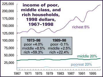
"Boom" is the word typically used to describe the U.S. economy these days. True enough if you own stocks. But, according to the Census Bureau's annual reports on income and poverty published last fall, the median U.S. household - the one in the very middle of the income distribution, with half the households above it, and half below - was only just a hair better off in 1998 than it was in 1989. In fact, most of the boom years have been devoted to recovering the income losses of the early 1990s. Poor households - those in the bottom 20% of the income distribution - still hadn't recovered 1989's level. And this in a time when GDP was up almost 30% after adjustment for inflation - 14% per capita, after accounting for population increase.
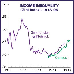
So where'd all the growth go? It went mainly into the pockets of the richest 5%, whose incomes are up 22% since 1989, with more than half of it coming in the last 5 years. (And though the Census figures don't show it, other sources show that those gains mainly went to the top 1­2%.) Inequality of family incomes in 1998, as measured by the Gini index (see box on facing page), was at its highest ever since the Census Bureau started publishing annual figures in 1947; that for the broader category of households (which includes singles and nonfamily arrangements) fell slightly from 1997's record level. Figures for years before 1947 are hard to come by, but by at least one measure - that assembled by Eugene Smolensky and Robert Plotnick - the U.S. hasn't seen this level of polarization since the 1930s. The figures are much worse than the 1980s, when people used to worry more loudly about inequality; now, with a Democrat in the White House, think-tank liberals are less likely to moan.
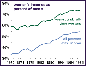
The gender gap narrowed slightly from 1997 to 1998, but that progress has slowed considerably in recent years. Women earned 54% as much as men in 1998, barely higher than 4 years earlier. For year-round, full-time workers, women earned 74% as much as men, slightly lower than in 1996. It's hard to tell whether this is just a pause, or something of longer-term significance; one reason to believe the former is that men tend to work in more cyclical industries, like manufacturing, so they do relatively better in good times and relatively worse in bad ones. But maybe women have run into an economy-wide glass ceiling. We'll see.
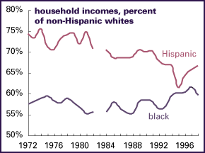
Racial/ethnic gaps are a mixed bag. Though the black/white differential has been closing raggedly since the late 1980s, that's not true of the last couple of years (though it should be pointed out that this is because white incomes were up more strongly than black, not because of a decline in black incomes). So-called "Hispanic" households - the skeptical phrasing and punctuation is an expression of doubt that this category has much analytical power, given the vast difference between the groups gathered under this single label - have been doing better in recent years. But that bounce barely compensates for the widening of the income gap from the early 1980s into the early 1990s, which is mainly the result of the arrival of poorer immigrants. (For more on immigration see p. 8.) [Article in print edition; not on this site.]
The poverty rate declined slightly from 1997 to 1998, from 11.6% to 11.2% - but the trend over the last 20 years has been remarkably flat, despite supposed boom conditions. And that's by a very flawed measure. The U.S. poverty line was established nearly 50 years ago, on the basis of some very casual research: the government's estimate of a minimal food budget was simply multiplied by three, on the rationale that households spent an average of one-third of their incomes on food, and that level has been adjusted for inflation ever since. No adjustment has been made for rising average incomes or changing consumption norms. As a result, the poverty line has continued to decline as a percentage of median incomes - from 43% of the median in 1959 to 33% in 1982 to 28% in 1998. Were poverty defined more reasonably - like, say, half the median income, a common metric among academic researchers - U.S. poverty rates would be half again to twice as high as they are.
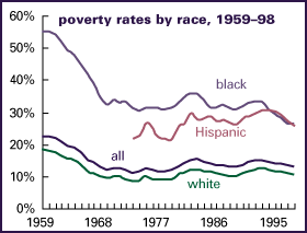
The good news about poverty is that the black poverty rate is the lowest on record, by a very flawed measure. The bad news is that almost 28% of female-headed households are officially poor, and 19% of our children live in poor households. The amount of money it would take to bring all officially poor households up to the poverty line is amazingly small: 0.5% of GDP, or just over 3% of the income of the richest fifth of households. It would take a bit more money to bring the poor up to a civilized standard, but not that much. Clearly it's much more important that the affluent be able to buy stocks and SUVs than to accomplish this bleeding-heart goal.
Home Mail Articles Stats/current Supplements Subscriptions Links