Home Mail Articles Stats/current Supplements Subscriptions Links
The following article appeared in Left Business Observer #103, December 2002. It retains its copyright and may not be reprinted or redistributed in any form - print, electronic, facsimile, whatever - without the permission of LBO.
This is the latest version of a series of articles on the annual income and poverty stats for the U.S. The Census Bureau stats from which most of this is drawn are available in plenitude on their website: income is here, poverty here.
an update, and not an exhaustive treatment of the subject. For a more thorough income and poverty workout, see articles in LBO issues 61, 65, 69, 80, 93, and the supplement on income and poverty .
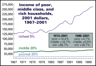
2001 wasn't a good year for most Americans - and for that matter, 2000 wasn't either. After falling 0.4% in 1999, incomes at the midpoint of the distribution - the median - fell 2.2% in 2001 (after adjusting for inflation). That follows a 15% increase during the 1990s boom - stronger than the 13% of the 1980s. But the 1980s boom was bracketed by harsh recessions, each of which took more than 5% off average incomes. That, combined with the crummy economy of the 1970s, meant that in real terms, 1993 incomes were barely above those of 1973. So the extended run of the 1990s was a refreshing change for most Americans.

That was at the middle. At the low end, among the bottom 20% of households, recession losses have been almost twice as large as in the middle - a sharp reversal of the boom, during which incomes of the poorest fifth of households rose more in percentage terms than any other. Their reversal of fortune was especially remarkable; earlier periods of gain were much less than the median enjoyed, and the recessionary hits were more severe.
Richer households have done better than the nonrich during the downturn; incomes for the richest fifth rose almost 2% in 2000, and fell just 0.2% in 2001. For them, the last 30 years have been a period of almost uninterrupted gains; they suffered no sustained losses in the recessions of the early 1980s and early 1990s, and their gains during the 1980s boom outstripped everyone's. But the performance of that elite group has been led by the stellar performance of the top 5% (those with incomes over $150,499 in 2001), whose incomes rose last year, and who beat the averages during the 1990s - and gained income even during the hard times of the early 1990s. The next 15%, those with household incomes between $83,500 and $150,499, have been flat over the last two years, and enjoyed income gains merely in line with the average during the good years.
But it must be said that the boom of the 1990s was much more broadly felt than that of the 1980s. Yes, inequality rose - more on this in a bit - but at least every demographic group saw strong gains, unlike the 1980s, when the rich took it all. The main reason was that labor markets got very tight. Unemployment in the 1980s expansion averaged 6.8% and never got below 5.0% - but in the 1990s boom, it averaged 5.5%, and bottomed at 3.9%. And tight labor markets in the 1990s meant strong wage and income growth across the board.
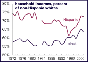
That tightness did a lot to close racial income gaps. Hispanic and especially black households saw faster income growth during the boom than nonhispanic whites, and have taken smaller hits in the bust - probably because the unemployment rate is still low by recession standards.
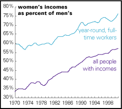
Women, too, narrowed the gender gap during the boom. And unlike the 1980s, when the gap narrowed as much because men's real earnings were falling as women's were rising, during the 1990s expansion, men's income rose - only women's rose more. Since 1999, men's incomes have fallen - male employment and income usually suffer more in a recession than female - while women's have continued to rise.
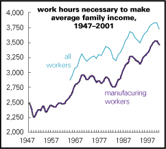
Of course, "tight" labor markets mean more people are working, which has the virtues just enumerated (and probably contributed to the drop in the crime rate as well). But more work isn't an unmitigated good. In 1999, late in the boom, the number of workers holding multiple jobs was over 40% higher than the number officially unemployed, and even now, after the disappearance of 1.6 million jobs, the ranks of the unemployed are just 18% larger than the ranks of the multiply employed. And, as the work hours chart shows, the effort necessary for a worker paid the average hourly wage to earn the average family's income has risen almost without interruption for over 50 years (the interruptions happening mainly during recessions).
Yet despite the narrowing of racial and gender gaps - the reduction in forms of what is sometimes called "between-group" inequality - overall inequality has extended its long rise, which began in the late 1960s. (And not all between-group gaps were narrowed: workers with bachelors degrees and higher expanded their already considerable advantage over those with high school diplomas or less.) So it's highly likely that "within-group" inequality has continued to rise - that is, inequality among people in similar demographic groups, when sorted by race, sex, educational level, or occupation.
Charted nearby is the gini index, a common measure of what value-neutral economists prefer to call the "dispersion" of income, since 1913. (It's cobbled together from two series: estimates through 1966 are based on those from a 1992 paper by Eugene Smolensky and Robert Plotnick, and from 1967 on, on the Census Bureau annual numbers.) The gini is usually expressed as a decimal value between 0 and 1; in a perfectly equal society, it would equal 0, and in a society where one person had all the income, it would equal 1. The numbers make little sense in themselves, but they're useful in tracing one society over time or comparing different societies at once. (For more, see here.)
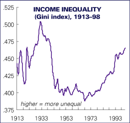
Though the gini could theoretically be anywhere between 0 and 1, the real-world extremes are places like Brazil, where it approaches .600, and Sweden, where it comes in around .220. The U.S. generally scores the highest of all the rich countries.
Estimates for the early years should be taken only as rough guides, but it's safe to say that income inequality is at levels not seen since the climax of the 1920s boom and the collapse into Depression. After peaking in 1932, the gini began a long downtrend that ended in 1968. It's been almost straight up ever since, pausing only during the mid-1970s and early-1990s recessions.
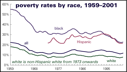
Poverty rose a bit too, from 11.3% of the population in 2000 to 11.7% in 2001, after a long decline in the 1990s, (when black and Hispanic households led the way down). Even after last year's rise, official penury overall is hovering around its all-time lows, levels last visited in the 1970s, though still above 1973's low of 11.1%. As decent as that may sound, it sounds much less impressive when you know how the U.S. poverty line is figured. It was set rather arbitrarily in the early 1960s, and has simply been adjusted for inflation ever since. So conceptually, a poverty-line income today has the same buying power as it did over 40 years ago. Since average real incomes are 36% above 1973 levels, and the real value of the poverty line is unchanged, that the poverty rate is almost the same as it was 28 years earlier means that the incomes of the poor have badly lagged those at the middle, who themselves have badly lagged the rich.
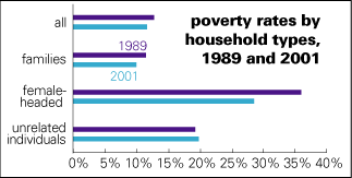
As usual, poverty rates are highest among single-mother households, though they did enjoy a healthy decline in their poverty rate during the 1990s, a result of tight labor markets. Yet despite that decline, their poverty rate is still over twice the national average. Faring a bit better were "unrelated individuals" - Census jargon for people living singly or together in nonfamily households; they have a poverty rate just under twice the national average.
The 1990s also delivered an extended decline in the black poverty rate. Nearly four times the white rate in 1989, by 2001, it had fallen to under three times. Progress, but still quite a ways to go.
What better way to clear one's head after all these numbers than to make a couple of larger, political points?
The relatively good times enjoyed by the American masses during the 1990s were the happy byproduct of a boom that turned out to be unsustainable. It depended on massive inflows of foreign capital and a level of employment and investment that were inseparable from the dominant irrational exuberance. And the reason that Wall Street and the Federal Reserve tolerated sustained low levels of unemployment was that most of the rest of the world was doing rather poorly, which kept a lid on global inflationary pressures.
Over the long term, relying on tight labor markets to deliver higher standards of living to the broad U.S. population just won't do the trick - business cycles are too ephemeral to base sound social policy on. What delivers higher living standards are the old verities, now discredited in elite circles - unions, vigorously enforced antidiscrimination laws, a higher minimum wage, and a civilized welfare state. And we're going either nowhere or backwards on all these points; just to take one, the real value of the minimum wage is off 11% since it was last raised in 1997. Congress is considering an increase, but it doesn't seem to be an urgent priority - and it's not considering anything like the magnitude of an increase necessary to match its 1968 peak of $8.50 (in today's dollars).
And second, the high levels of poverty and inequality in the U.S. create a social structure that's very comfortable for the upper brackets; they have an army of insecure, low-wage helpers at hand, ready to clean their houses and rent them videos. But this polarized relation has never become much of a political issue. U.S. poverty rates and inequality figures are among the worst in the rich world, but as everyone knows, class politics just doesn't play here, though the evidence is inconclusive on whether it's ever been tried.
|
nomenclature This report uses the same racial and ethnic classifications that the U.S. Census Bureau uses, though with reservations. Households are classified as "black" if the "householder" - the person in whose name the dwelling is owned or rented (and if it's a married couple jointly named, then it's one of the two) - is black. Any within-household racial diversity is effaced by the classification. Householders themselves have to be of a single "race": white or black or Asian or American Indian, never any mix. Clearly modern American reality is more complicated than this ancient typology allows. And, in a classification separate from race, households and their householders are either Hispanic or non-Hispanic. Hispanic people are those of "Mexican, Puerto Rican, Cuban, Central or South American" origin, which lumps light-skinned Argentines and dark-skinned Puerto Ricans into a single category. So why retain the categories at all? Because it matters when people are classified by the state, and race and ethnicity are important parts of American social life. The categories are with us and they affect the way we think and act. Just ask Trent Lott. |
Home Mail Articles Stats/current Supplements Subscriptions Links