Home Mail Articles Supplements Subscriptions Radio
The following article appeared in Left Business Observer #130, November 2010. Copyright 2010, Left Business Observer.
Like this? Subscribe today! There’s a lot more where this comes from—and only some of it makes it to the web for free consumption.
What a damn mess
You were under the impression
That when you were walking forward
You'd end up further onward
But things ain't quite that simple.
—The Who, “I've Had Enough” (1973)
The time seemed ripe for a comprehensive look at the state of the U.S. economy—not the usual a little of this, a little of that approach, but some measure of how it all fits together. It will come as no surprise to most readers that the state is dismal. Not only are the masses doing rather poorly, but even the most orthodox measure of all, GDP growth, is in the tank. But this is not perceived as an emergency in some circles, because the elite is doing very, very well.

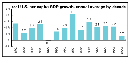
Let's start with that fetishized measure, GDP growth. As the graph above shows, the average growth in real GDP per capita for the 2000–2010 decade has been 0.7%. (Yes, the decade isn't over, but it's only got a quarter to go. It would take a Chinese rate of growth—almost 13%—in the fourth quarter of this year just to get the decade average up to 1%.) You might object that decades are arbitrary forms of periodization, which they are (and what isn't?), though they do have some cultural purchase.
If you look just at trend rates of growth, using a statistical technique called a Hodrick–Prescott filter, the underlying rate of growth in the U.S. economy is now 0.3% a year, the slowest ever by a long shot, and less than a fifth its long-term average.
The recession contributed a lot to this record low, but even if you stop the trend computation at the peak year, 2007, you get the lowest growth rate in 80 years. The 2001–2007 expansion was the weakest of the ten since 1948, when quarterly GDP data became available. Combine that weak expansion with the deepest recession since the 1930s—more than twice as deep as the average of the last ten downturns—and you get truly a miserable decade.
That record-breakingly weak trend, is must be underscored, is considerably weaker than that of the mid-1930s. The reason for that is that the Great Depression was preceded by a serious boom, the 1920s, and interrupted by a remarkably strong recovery from 1934–1937. And while that 1920s expansion was hardly short on froth, it also put the radio and the automobile into wide circulation. The 2001–2007 expansion gave us little more than some empty subdivisions outside Vegas and see-through condos in Miami.
Help wanting
For people who aren't economists, GDP is a largely meaningless abstraction. It would be hard to find five people out of a hundred who could tell you if a 2% growth rate was good, middling, or bad. What matters to most people are jobs and pay. And those indicators, too, are terrible.
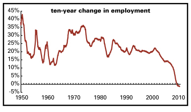
The graph above shows the ten-year change in employment—a running score of job growth over the previous decade. From 1949 through 2000, it averaged 24%. It got to as high as almost 50% in the years just after World War II, and to a low of around 12% in the early 1960s. But that same combination of weak expansion followed by sharp recession took this measure below the zero line for the first time in late 2009. We don't have monthly numbers before 1939, just yearly ones starting in 1900 (and less rigorously collected than today), but it looks like the only time the ten-year employment change went negative in the early 20th century were the Depression years of 1932 to 1939. But those years were bracketed by periods of strong employment growth. We haven't seen such a thing in a decade.
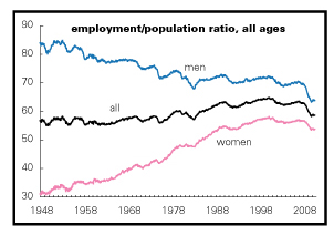
With employment growth so dismal, the share of the adult population working (graph above) has is back to 1983 levels, which were only slightly higher than those of the 1950s. The male employment/population ratio (EPR) has been in a long decline. Back in the 1950s, almost 85% of adult men were employed; that share fell to around 70% in 2000, and is now around 64%. But women entered the paid labor force in large numbers, bringing their EPR from around 30% in the early 1950s to nearly twice that, 58%, in 2000, pulling up the overall average. But the EPR for women flatlined during the recent expansion and has since declined to 54%, taking us back to 1991 levels.
And even within the ranks of the employed, things aren't going so well. Almost 7% of the employed are working part-time because that's all they could find, a record high in the 55 years these statistics have been gathered. The recent recovery in employment, such as it is, has been dominated by temporary help firms, health care, retail, and bars and restaurants. There are some good health care jobs, but there are also lots of low-wage ones, and the good news for this sector has been bad news (in the form of medical inflation) for the rest of us. The other three sectors, though, are mostly low-wage. And, aside from wages, these sectors are not foundations for serious long-term economic dynamism, as lovely as shopping and eating can be.
Utopian parenthesis: a world where vast numbers of people are working for pay may not be everyone's ideal. But in the society we live in, if you don't have a paycheck, you're in imminent danger of having no roof over your head.
Class angle
Not only has the job market been remarkably weak, so to have been the rewards for those who are employed. This is true on almost any time scale, from a single quarter to thirtysomething years.
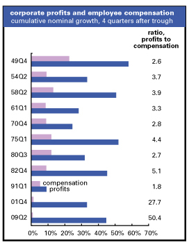
First up, the taxonomy of the recovery, such as it is, so far. The graph above plots the growth in total wages and salaries against the growth in corporate profits for the first year of the last eleven recoveries. Profits are always more volatile than wages—they fall more sharply in recessions and recover more vigorously. But we've never seen anything like this one before. The average ratio of profit to wage and salary growth for the previous ten recoveries is three-to-one; the latest is fifty-to-one. At 0.9%, wage and salary growth is barely visible on the graph—but profit growth is at the high end of historical experience.
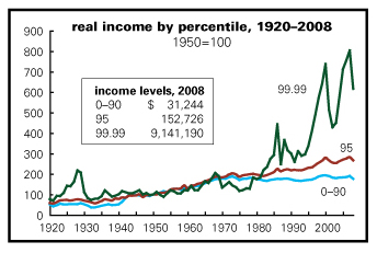
To take a broader look, the graph above shows Thomas Piketty and Emmanuel Saez's data on average inflation-adjusted incomes for the bottom 90% of the population, income at the 95th percentile (the level that's richer than 94% of the population), and at the 99.99th percentile (the richest 0.01%). (The familiar annual Census Bureau numbers are based on a large survey of households that inevitably misses the rich; the Piketty–Saez data come from tax returns. Since the rich are quite skilled at evading taxes, their figures probably understate life at the top.) From the early 1930s through the late 1960s, the incomes of the masses and the rich grew more or less in tandem. Then, tragically, growth at the high end began seriously to lag the broader population. While the incomes of the bottom 90% (by the Piketty–Saez measure fell by 2% from 1968 to 1978, those of the top 0.01% were down by 38%. This was clearly a social emergency.
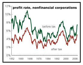
The next graphs offer different perspectives on the emergency and the eventual rescue of the upper orders. Above we see a history of the profitability, before and after taxes, of nonfinancial corporate America. It's computed by dividing the measure of corporate profits from the national income accounts by the value of their physical capital stock (buildings and machines) as estimated by the Federal Reserve in its flow of funds accounts. Profitability was quite high during the 1950s and early 1960s—especially before taxes, since the effective tax rate (that is the rate they actually paid, not the one on the books) was around 50%. Profits rose into a 1966 peak (and the tax rate declined to around 40%)—but then began a long slide that was not at all cushioned by further declines in the taxman's share, which bounced around the mid-40s.
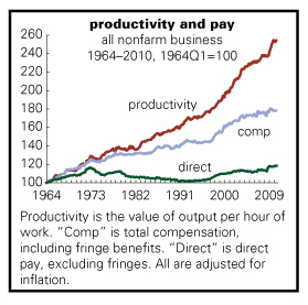
A pair of reasons for this dismal situation: productivity growth began to sag, while total compensation (including fringe benefits) continued to grow. The narrower measure of direct pay (excluding fringes) stalled in 1973 and declined for the rest of the decade. (See graph above.) But employers were still covering health insurance, and more quaintly, pensions, boosting the total compensation measure.
Crackdown and payoff
The whole state of affairs was clearly unsustainable. And so, as this newsletter has pointed out several times in analyzing the prehistory of our current crisis, the American elite mobilized. There's not much point in reprising the full history, since LBO has done that before, but here's the capsule summary: Paul Volcker took the helm at the Federal Reserve and created the deepest recession since the 1930s (a record we've only just recently broken!), scaring the hell out of the working class. And then Ronald Reagan moved into the White House, fired the air traffic controllers (declaring open season on organized labor), squeezing domestic spending, and cutting taxes on corporations and rich individuals. A massive upward transfer of income began.
On the personal side, income growth for the mass of society slowed to a crawl—an average of 0.2% a year between 1982 and 2008 (at a time when GDP growth averaged 3.2% a year), compared to 1.7% a year between 1948 and 1982. But at the 99th percentile, income grew an average of 2.3% a year after 1982, compared to 1.4% in the previous 34 years. At the 99.99th, a level consisting of about 12,000 households (average income in 2008: $9.1 million), it was 4.1% vs. 2.1%. In other words, growth at the very top was 20 times as strong as the bottom 90% of the population. Remarkably, the 90th percentile's performance pales next to that at the very top: that set (average income in 2008: $109,000—which is curiously what most people would think of as barely upper middle class), saw income growth of 0.9% a year between 1982 and 2008, compared with 2.2% in the earlier period.
Aggregating these changes produces some amazing results. Since 1982, the bottom 90% of the population has split about 40% of total income growth, leaving the other 60% to be divided by the richest 10%. Within that 10%, almost half went to the richest 1%. Since 2001, the skew has been even sharper, with the bottom 90% getting less than 25% of the growth income, and the top 1% getting about 36%.
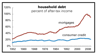
To sustain purchasing power, people turned to borrowing (see graph above). It's hard to see because the mortgage line distorts the scale, but consumer credit—basically credit cards and auto loans—rose from about 16% of after-tax income in 1982 to almost 25% in 2005. Mortgage debt rose from just over 40% of after-tax income in 1982 to around 60% in the late 1990s—and then really took off with the housing bubble, peaking at almost 100% of after-tax income in 2007. Then the bubble burst, the credit markets froze, and outstanding debt has declined relative to income—though obviously it's got a long way to go to get back to pre-bubble levels.

On the corporate side, profitability began a fifteen-year long rise from its 1982 trough to a 1997 peak, a rise that recouped about two-thirds of the earlier decline. (See graph above.) Amplifying the pretax rise in profitability, the effective tax rate fell below 30% in 1982, and averaged 32% during the 15-year profit boom. The dot.com bust and subsequent recession weren't kind to profits, with the pretax line revisiting the early-1980s lows, but this time the tax bite was much mellower, around 30%. But the Bush bubble, while terrible for employment (unlike the 1990s expansion, which generated some real job and wage gains along with the Nasdaq froth) was damn fine for corporate profitability, taking the pretax line close to the 1997 peak, and with some of the lowest tax rates in modern history, around 30% and sometimes below. The 2008–2009 recession, which was hell on the working class, did only mild damage to profits, and the recovery has been strong, with profitability surpassing the recent 2006 high. And the tax rate averaged 29%. Capital has been doing very well lately.
Not labor, obviously. With the end of the credit boom, the only things that have kept the household sector afloat have been transfer payments (like Social Security and unemployment insurance) and tax cuts. Over the last three years, all of the growth in personal income has come from transfer payments. At the same time, the effective tax rates on personal income—the taxman's share of al personal income—has declined from almost 13% to just over 9%. Without those props, the economy would have imploded completely—which is why austerity is such a dangerous prescription now.

But can it last? Can the rich as individuals and corporations as a legal form continue to thrive while the rest of the economy is stagnating around them? They seem to betting on “yes.” And the American masses seem to be acquiescing, and taking out what rage they have on the weak. It's tempting to root for rot, if only to see the elite's foundations collapse to the ground, but that would crush everyone below them. It's not a pretty picture.
Home Mail Articles Stats/current Supplements Subscriptions Radio